Charting 50 Years Branding
Charting 50 Years - Branding Guidelines
For questions or coordination related to Patriots Point's Charting 50 Years branding assets, please contact our Interim Marketing Director, Lauren Austin, at lauren.austin@patriotspoint.org.
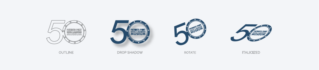
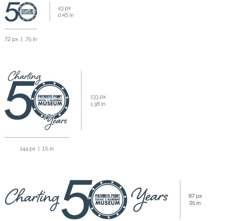
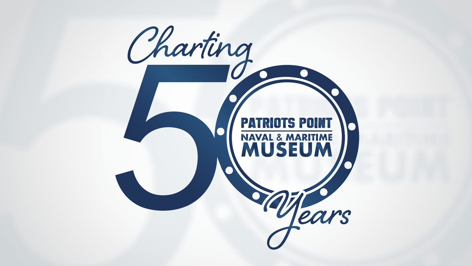
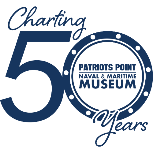
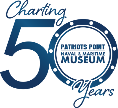
Primary Logo Our logo is a system of visual elements that can be used This logo should be used in all instances unless space is limited. It |
|
Gradient Logo Gradient form of the primary logo, featuring a smooth blend of colors that adds depth and visual interest. |
|
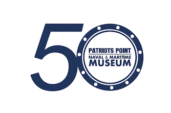
Icon A reduced form of the Logo; only use if there is insufficient The icon should only be a solid color, never gradient. |
|
Horizontal This mark should be used to maximize logo size when |

|
Color The primary color palette consists of three colors. |

|
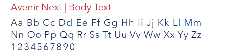
Avenir Next This clean, modern sans serif is easy to read in text-heavy areas and across interfaces. |
|
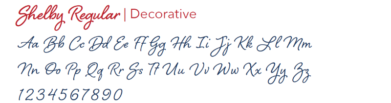
Shelby This typeface is a semi-connected handwritten script and should be used sparingly. |
|
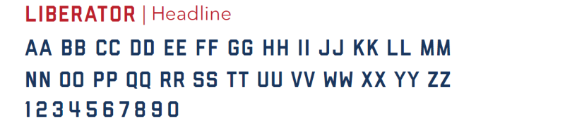
Liberator A bold, bomber-inspired sans serif reserved for a high-impact appearance in design. |
|